Entity Map – Explore Content Relations
The Entity Map is a visual tool to investigate relations extracted from online media coverage. It juxtaposes two types of patterns: co-occurrence among entities, and co-occurrence between entities and selected topics. The patterns are displayed using (i) an inner radial convergence diagram, and (ii) an outer line chart with a radial imposition, which have been carefully combined to produce a cohesive and balanced visualization. The Entity Map is the predecessor of the Relation Tracker, which provides additional analytic function and uses a rectangular layout instead of a circular one.
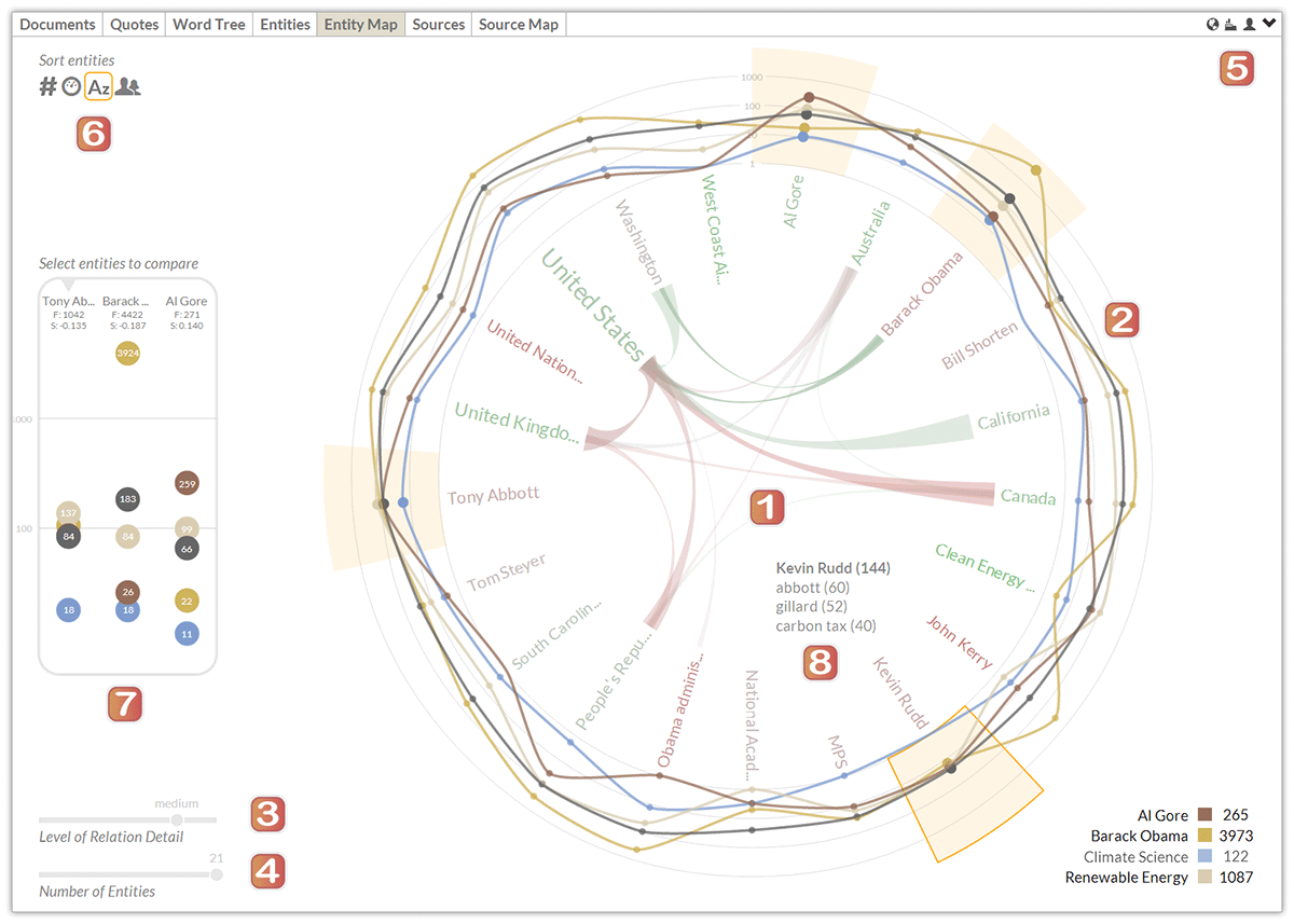
The major components of the Entity Map are described in the following, using a screenshot based on Anglo-American news media coverage from April to July 2014 as an example. For a query on “climate change,” the list of referenced entities includes politicians such as U.S. President Barack Obama and the Australian Prime Minister Tony Abbott, organizations such as the Green Energy Collective, and various locations including Washington DC and the State of California.
Main Entity Map Components
- Radial Convergence Diagram. Located in the center of the graph, the radial convergence diagram displays relations among different entities using ribbons. Entity names are displayed along a circle – their font size indicates the number of documents that mention the entity, their color ranges from red to green depending on the average sentiment (in line with the sentiment color coding of other dashboard elements). The thickness of an arc represents the number of co-occurrences between an entity pair. On mouse-over, the opacity of arcs that connect the selected entity to other entities is increased.
- Line Chart. Surrounding the radial convergence diagram in the center, the data points in the line chart show the number of co-occurrences between an entity and the selected topics (using the same color-coding as the trend chart). To increase the readability of the display and facilitate comparisons across topics, the line chart uses a logarithmic scale.
- Level of Detail. A slider element in the lower left corner controls the level of detail in the radial convergence diagram – i.e. it determines the threshold for showing relations among entities.
Entity Selection and Sorting
- Number of Entities. The second slider element in the lower left corner adjusts the number of entities to be shown, between a minimum of three and a maximum of 50 entities.
- Entity Types. Three small icons in the upper right corner control which entity types are displayed – persons, organizations and locations (of which at least one needs to be active).
- Sorting Criteria. Clicking on an icon in the upper left corner causes the entities to be re-arranged by (i) entity type, (ii) name, (iii) the number of documents which contain an instance of the entity’s name in descending order, or (iv) the average sentiment of the documents containing the entity, from positive to negative.
Additional Display Features
- Sidebar (available only in maximized view). Clicking on an entity displays supplemental information in a sidebar, which includes the data points with the co-occurrence values and the entity information – i.e., Name, Document Frequency Count (F) and Average Sentiment (S). The logarithmic scale adjusts automatically to accommodate the range of data values. The sidebar contains the three most recently selected entities, which remain highlighted in the graph.
- Tooltips and Interactive Features. The visualization is continually updated via smooth animated transitions. Hovering over an entity highlights its sector, shows a tooltip with the top three keywords associated with the chosen entity and highlights the arcs in the radial convergence diagram. Hovering over a topic removes all lines in the chart except for the one corresponding to the selected search term, reducing the complexity of the display.